NEW DAYS
Brand Transformation Unveiled: Potion Creative's Collaboration with New Days
Brand Strategy
Branding
Marketing Collateral
Copywriting
Art Direction
Social Media
OUR ROLE
TEAM
Rachel Ward
Annie Bhardwaj
YEAR
2022
In the ever-evolving landscape of brand identity, the role of a branding agency cannot be overstated. Potion Creative, a leading name in the realm of branding and design, exemplifies this with their remarkable transformation of New Days.
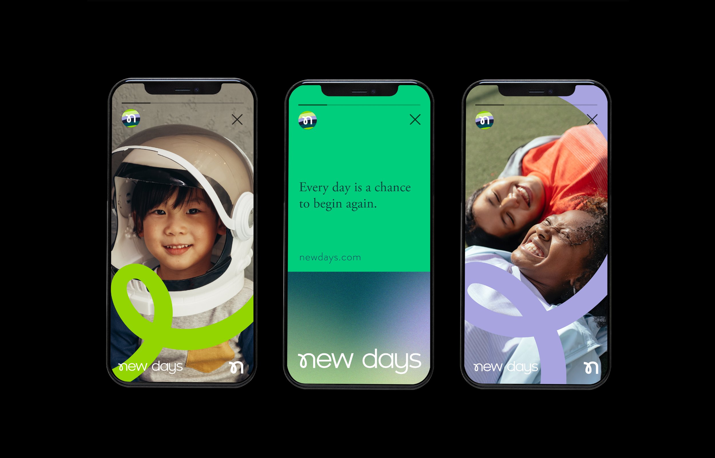
New Days is a team of compassionate mental health practitioners who are inspired by the ability that human beings have to be empowered for constant change and transformation. Every day is a new day and another chance to begin again. With New Days therapy individuals will learn to discover and overcome hurdles with the support of a licensed counselor.
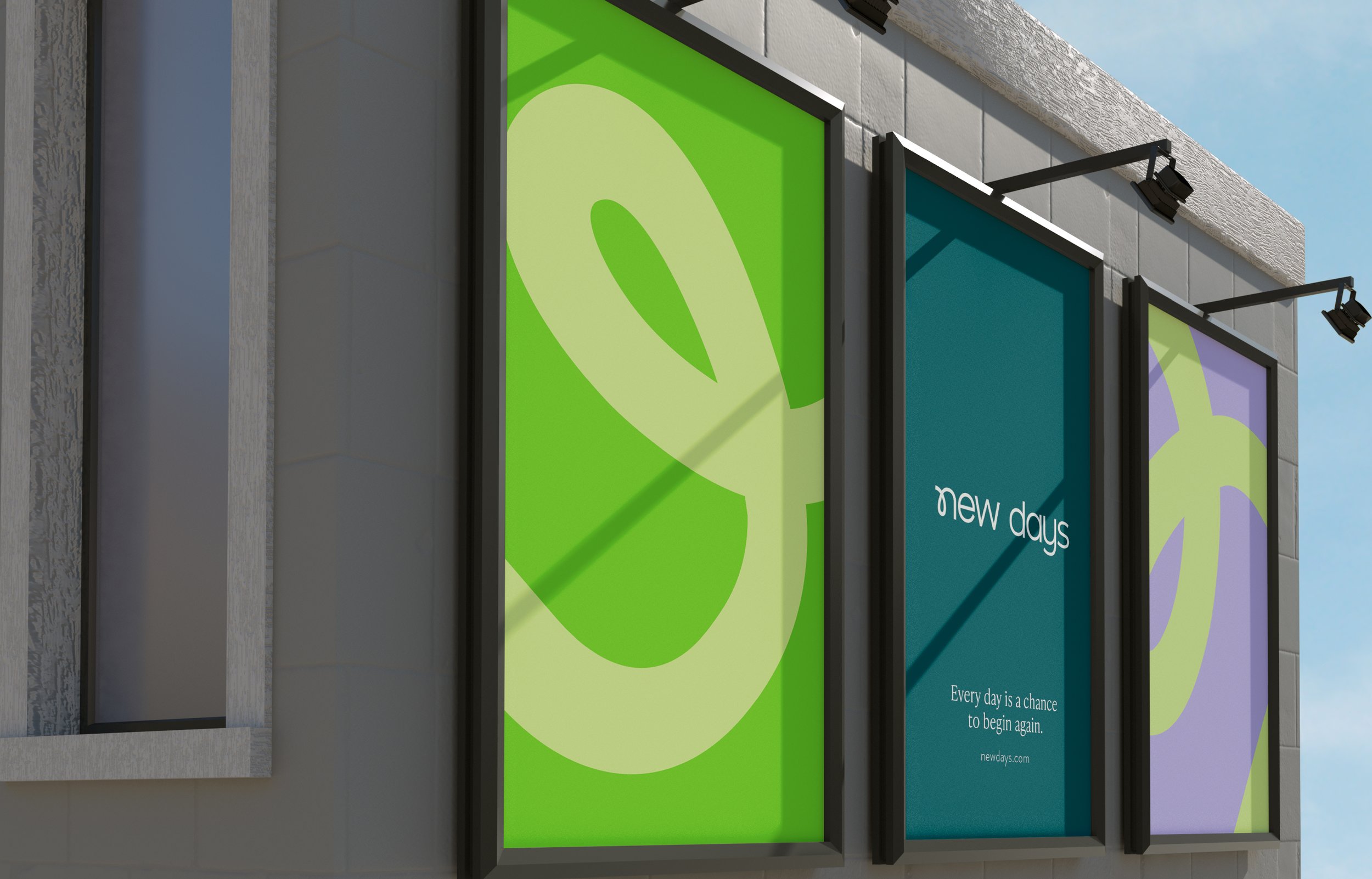
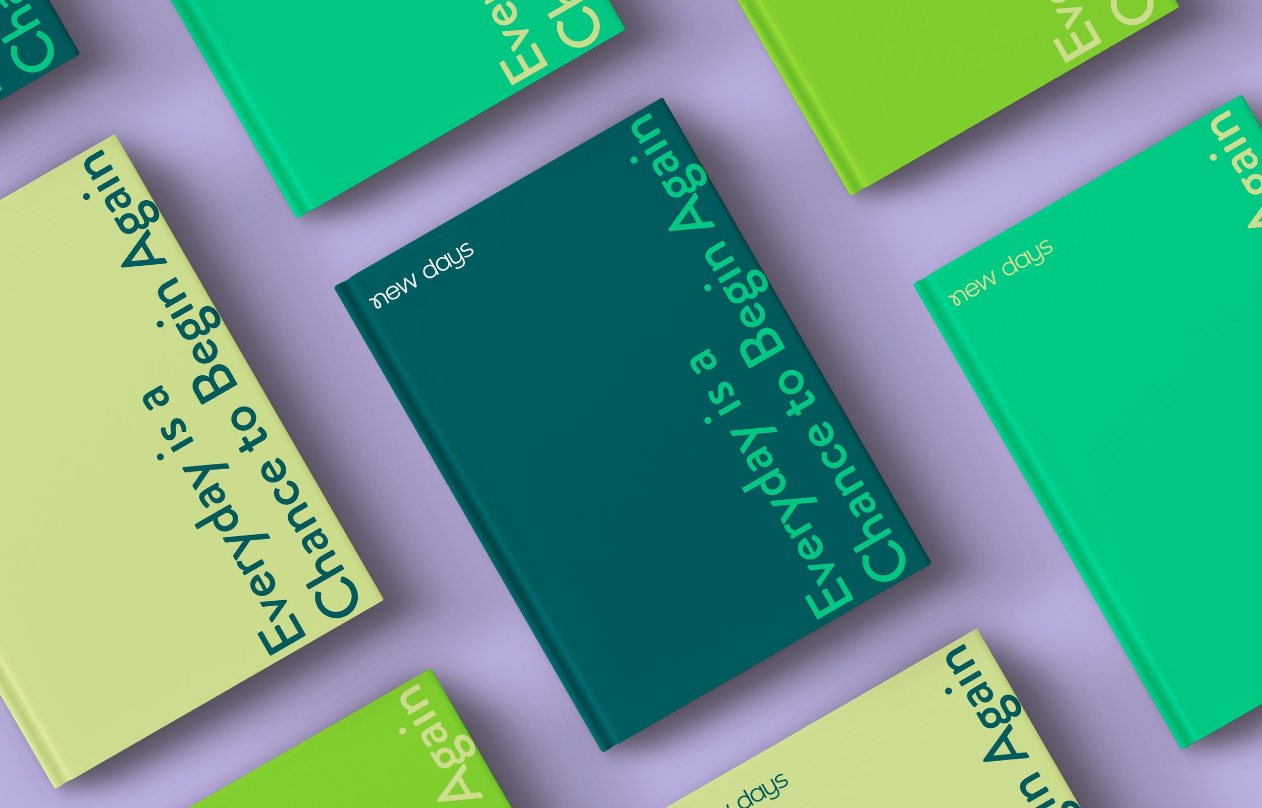
Our vision for the brand was on with a trans-formative edge. Full of empathy, transparency and sensitivity. One that forges away from the traditional. One that highlights the notion that change is constant. It’s the only thing we can truly guarantee in life. No matter how difficult, how unruly, how constant a state can often feel, it’s never permanent. With each day is a chance to start anew. Another go at the world. Another possibility to conquer challenges. To overcome thoughts, or feelings. As the sun rises, the golden rays pierce through to mark a new day. A new chance to begin again.

BRAND ARCHTYPE
The Caregiver. The Friend. New Days is a brand that is in tune with the feelings and emotions of their patients. Like a compassionate friend, one who is trustworthy, reliable, responsible and nurturing. Caregiver brands put their customers at the forefront of everything they do. The caregiver archetype is often associated with healthcare brands, not-for-profit organisations and family brands.

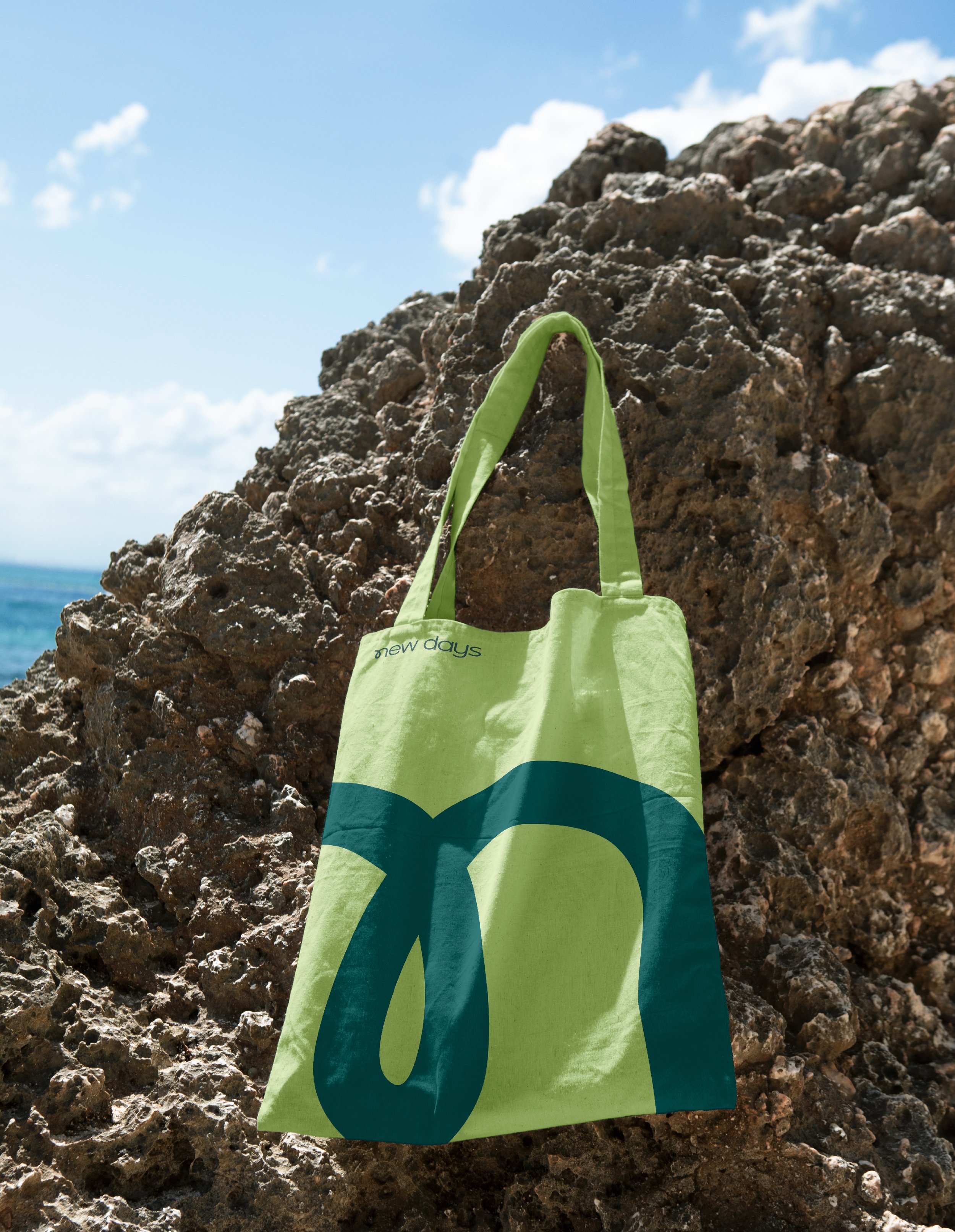

LOGO MARK
The logo embodies a dynamic and fluid design, featuring a gracefully curved stroke in the 'n' that imparts a sense of movement and individuality. This unique typographic choice not only serves as the foundation of our brand identity but also symbolizes the idea that every journey is inherently non-linear and distinctive. It captures the essence of "begin again," reinforcing the notion that each person's journey is a unique and evolving path, never following a predictable, linear trajectory. This distinctive font adds a touch of allure to The Logo, making it instantly recognizable and memorable, just like each person's personal journey.